Dashboard
The Dashboard is the monitoring center of the entire system. Here you can quickly get the most vital metrics of your marketing activity, find the top performers, and check historical results.
Top widgets
These widgets allow you to monitor your custom metrics to get insights on any stage of affiliate activity.
Select a period
The data for the top widgets adjusts to the date selected in the top right corner. You can select a custom period or use buttons to select the most popular periods quickly.
Set up widgets order
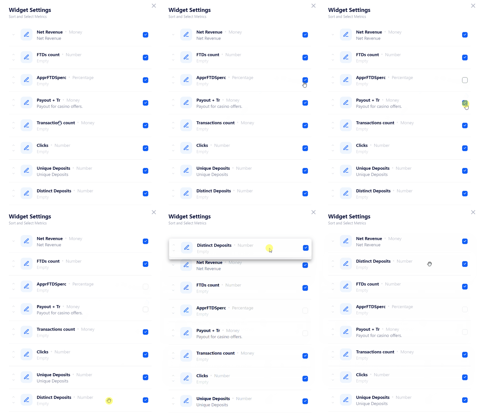
You can change the order of widgets or hide them by clicking the Gear button. It appears in the top right corner when you hover over the widget.
How to configure the Top Widget?
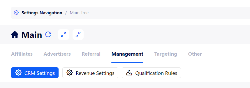
Go to Settings Navigation>Main Tree.
Open the Management tab then the CRM Settings tab.
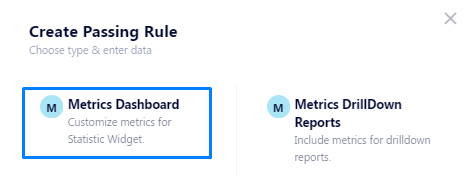
Select the Metrics Dashboard option.
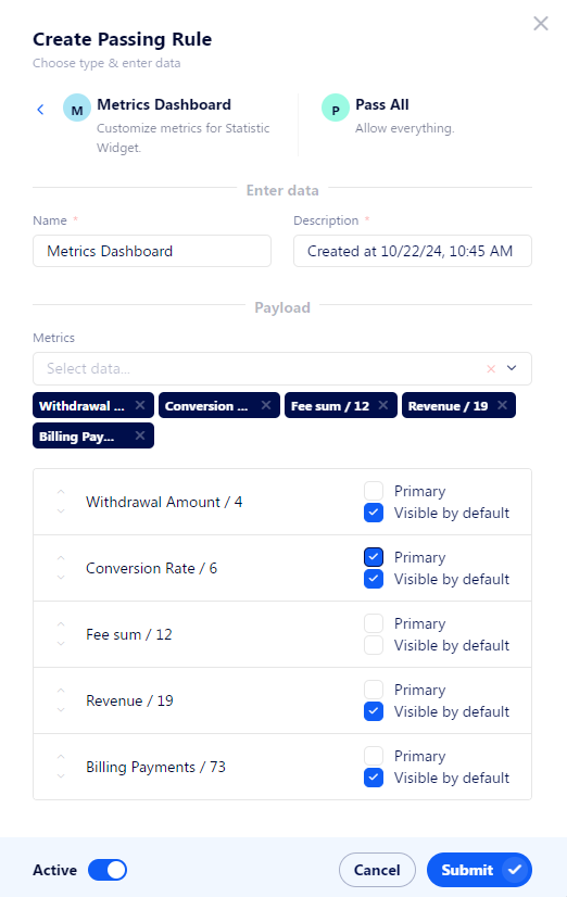
Select the metrics that you want to be displayed in the top widget.
All metrics have two configurable attributes:
Primary: the widget of that metric will be colored to draw attention.
Visible by default: this widget will be added to the widget by default. If it’s turned off, you need to additionally add it to the widget by using the Gear button.
The list of available metrics includes all metrics. If you need to add new metrics, read the following article.
Click Submit to apply changes.
General Chart
This chart allows you to visualize reports to get insights into the dynamics of the metrics that matter to you.
There are 3 aspects of the general chart you can configure:
Tabs: configure how to switch between charts. Useful when you need quick access to several charts.
Charts: define how to display data in the chart.
Metrics: define what data will be shown in the chart.
Currently, billing-related metrics are not available for this chart.
How to customize the General Chart?
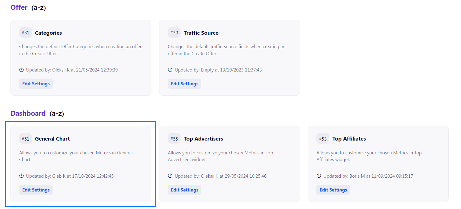
Go to Settings Navigation>CRM Settings, scroll down to the Dashboard section, and select the General Chart option.
Configure tabs
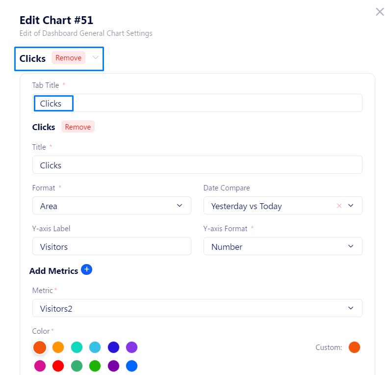
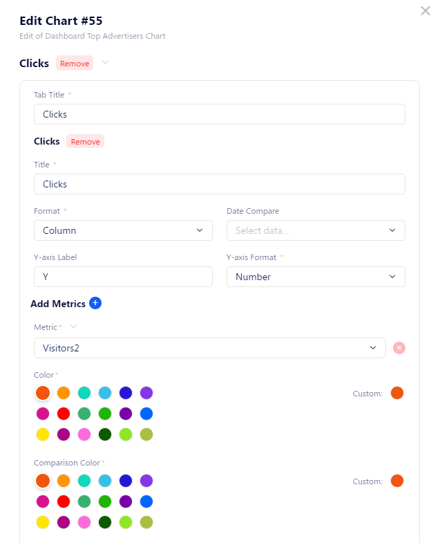
On top of the embedded frame of the modal window, you can see the title of a tab and a couple of buttons. Let’s describe what each one does:
Remove: delete the tab with its contents.
Arrow: it can be pointed either up or down. It allows you to change the order of tabs. The higher the tab is in the list, the closer to the left side it will be on the Dashboard.
To edit the tab name, use the Tab Title field.
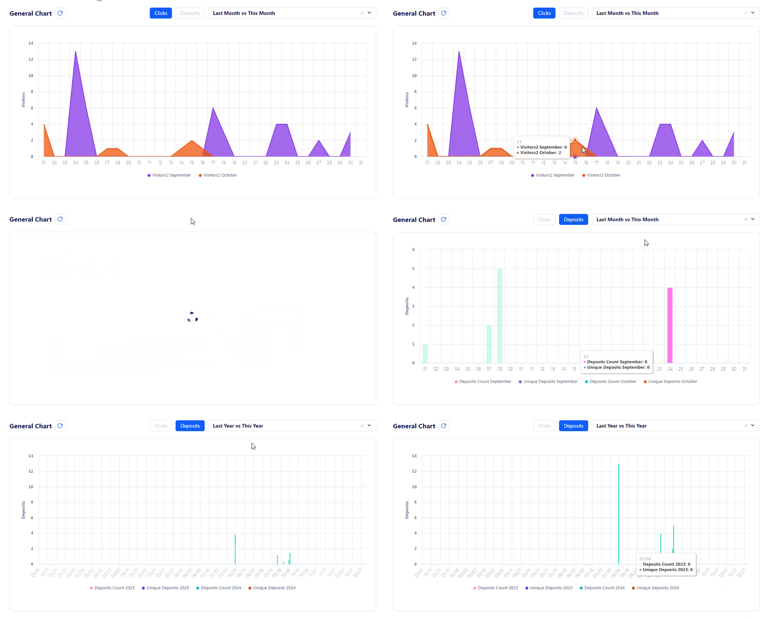
This is how tabs appear on the General Chart: they help you to quickly change between sets of metrics and chart types.
To add a new tab, scroll down and click the Plus button.
Configure charts
Below the Tab Title field, there is a group of settings devoted to the chart itself. It helps to configure what data will be present in the chart and how it will be displayed.
Here is an explanation for all fields in that area:
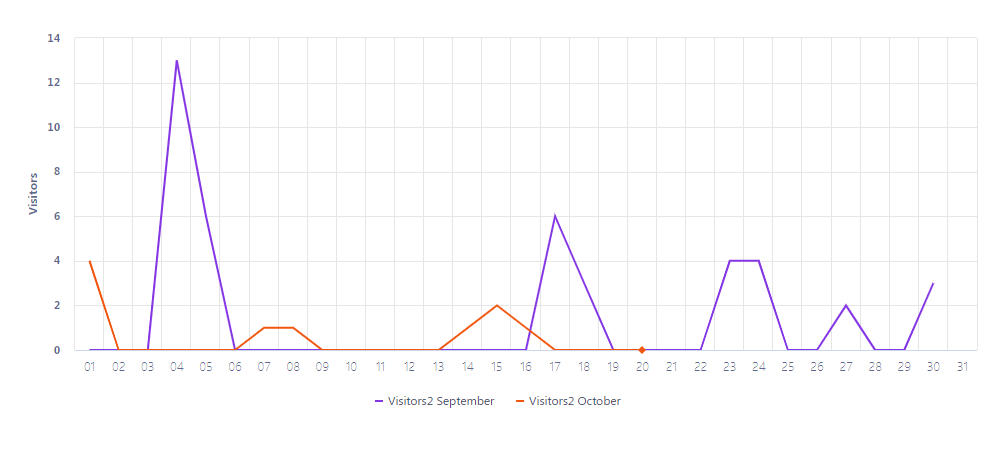
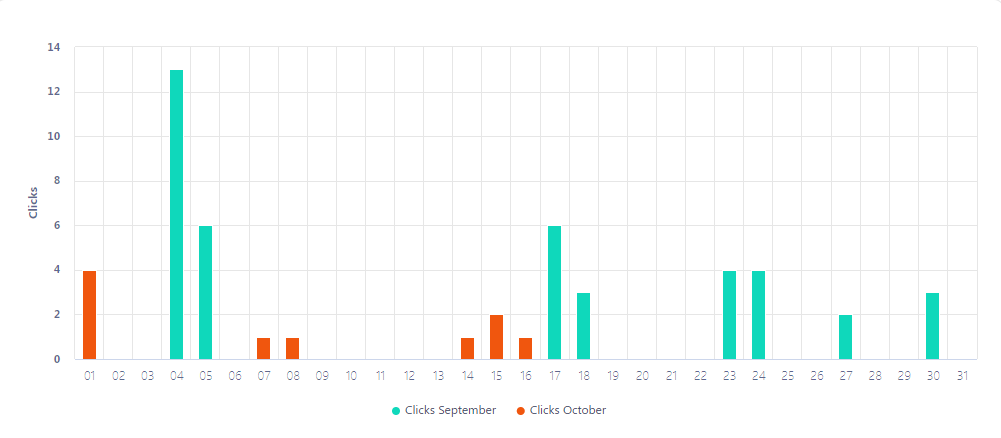
Format: define the type of the chart. It can be lines, columns, or areas. Here are examples for each type.
Line:
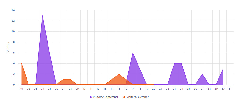
Area:
Column:
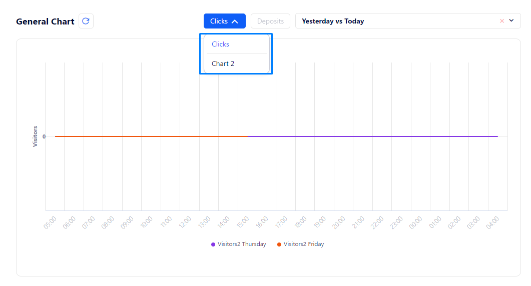
Date Compare: select the periods over which the data will be compared by default. For example, if you select the Yesterday vs. Today option, every time you open the Dashboard, you will be able to compare the data over these periods.
Y-axis Label: give a name to the vertical axis to easier understand what it represents. The horizontal axis always represents time; the step of the horizontal axis is configured by the selected date.
Y-axis Format: evaluate the results using currency, percentage, or just numbers.
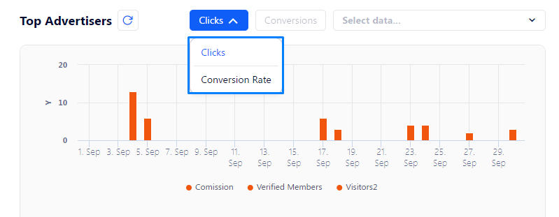
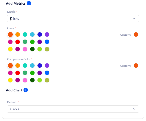
Add Chart: at the very end of the settings dedicated to a tab, you can see the Add Chart button. It allows you to add several charts for a single tab. So when you click a tab, a drop-down list appears with all the charts you’ve added to the tab.
Default: select the chart that will be shown instantly when the tab is selected.
Configure metrics
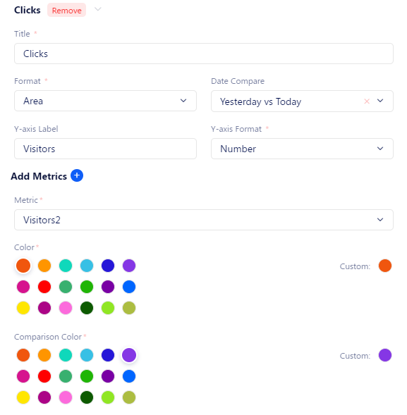
Finally, you can configure the metrics that will be shown in the chart. Each metric also includes the indicators for the previous period. You can add several metrics to a single chat.
Here is the full breakdown of all metric-related settings:
Metric: Define what data will be gathered in the selected timeframe, and shown via the chart.
Color: Select the color that will be used to highlight the metrics in the current period (this week, month, year, or today).
Comparison Color: select the color that will be used to highlight the metrics in the current period (last week, month, year, or yesterday).
Notifications
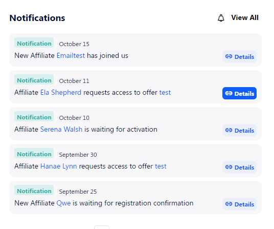
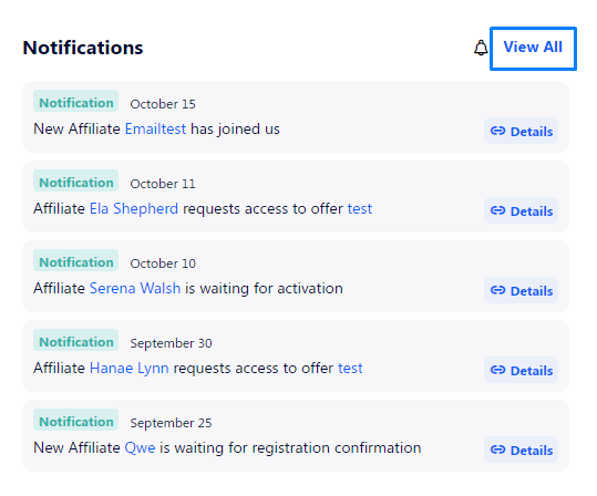
The notification center is placed to the right of the General Chart. It shows the latest actions related to conversions and affiliates. Click the Details button to get the exact time when the event occurred.
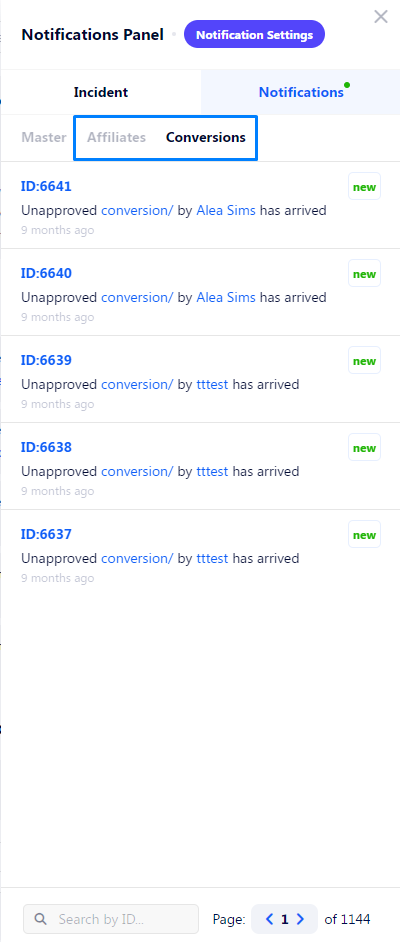
To filter notifications by type, click the View All button.
Then select either the Affiliates or Conversions tab.
Top Charts
The Top Charts have two main functions:
Show custom metrics similar to the General Chart.
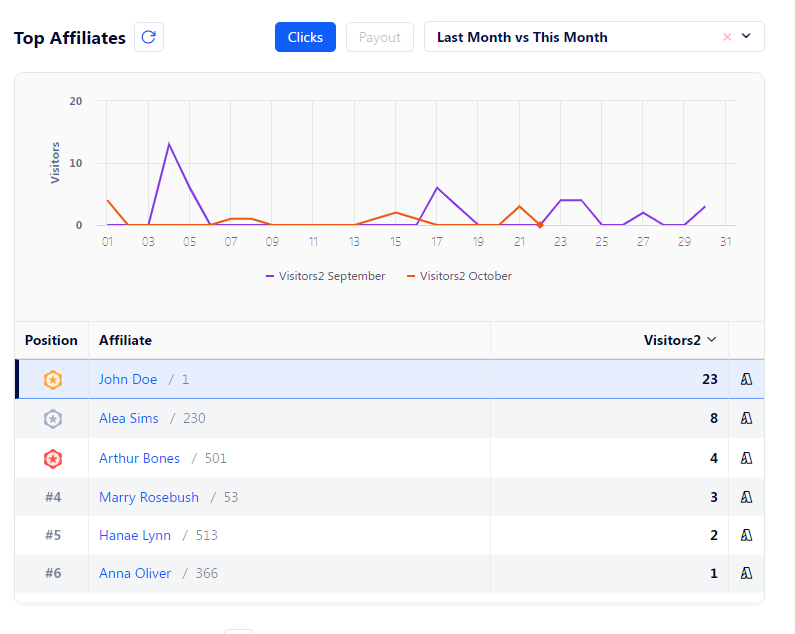
Show leaderboards by the selected metric.
The Top Charts focus on three main entities of an affiliate marketing activity: Offers, Advertisers, and Affiliates.
How to customize the Top Charts?
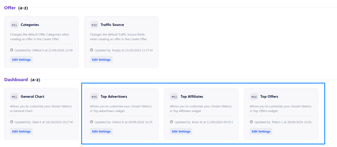
Go to Settings Navigation>CRM Settings, scroll down to the Dashboard section and select either Top Offers, Top Affiliates, or Top Advertisers.
Configure tabs
On top of the embedded frame of the modal window, you can see the title of a tab and a couple of buttons. Let’s describe what each one does:
Remove: delete the tab with its contents.
Arrow: it can be pointed either up or down. It allows you to change the order of tabs. The higher the tab is in the list, the closer to the left side it will be on the Dashboard.
To edit the tab name, use the Tab Title field.
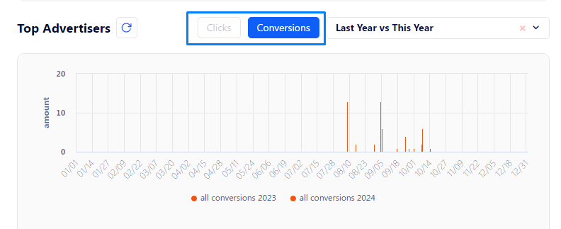
This is how tabs appear on the Top Charts: they help you to quickly change between sets of metrics and chart types.
To add a new tab, scroll down and click the Plus button.
Configure charts
Below the Tab Title field, there is a group of settings devoted to the chart itself. It helps to configure what data will be present in the chart and how it will be displayed.
Here is an explanation for all fields in that area:
Format: define the type of the chart. It can be lines, columns, or areas. Here are examples for each type.
Line:
Area:
Column:
Date Compare: select the periods over which the data will be compared by default. For example, if you select the Yesterday vs. Today option, every time you open the Dashboard, you will be able to compare the data over these periods.
Y-axis Label: give a name to the vertical axis to easier understand what it represents. The horizontal axis always represents time; the step of the horizontal axis is configured by the selected date.
Y-axis Format: evaluate the results using currency, percentage, or just numbers.
Add Chart: at the very end of the settings dedicated to a tab, you can see the Add Chart button. It allows you to add several charts for a single tab. So when you click a tab, a drop-down list appears with all charts you’ve added to the tab.
Default: select the chart that will be shown instantly when the tab is selected.
Configure metrics
Finally, you can configure the metrics that will be shown in the chart. Each metric also includes the indicators for the previous period. You can add several metrics to a single chat.
Here is the full breakdown of all metric-related settings:
Metric: define what data will be gathered in the selected timeframe and shown via the chart.
Color: select the color that will be used to highlight the metrics in the current period (this week, month, year, or today).
Comparison Color: select the color that will be used to highlight the metrics in the current period (last week, month, year, or yesterday).
Tracking Link Generator
Tracking Link Generator allows you to track clicks for configured Offers. Pass this link to affiliates so they can promote it on their resources and generate traffic.
Affiliates can also use the Tracking Link Generator, but only for the Offers that they have access to.
How it works?
When a lead opens such a link, the tracking information is captured via the tracking domain and quickly passed to the Partner Platform, meanwhile, the lead is redirected to the advertised page.
In cases where the advertised page is a funnel created on the Lead Distribution, the tracking domain is not used. Instead, tracking information is passed to the Partner Platform directly from the Lead Distribution.
How to set up a tracking link?
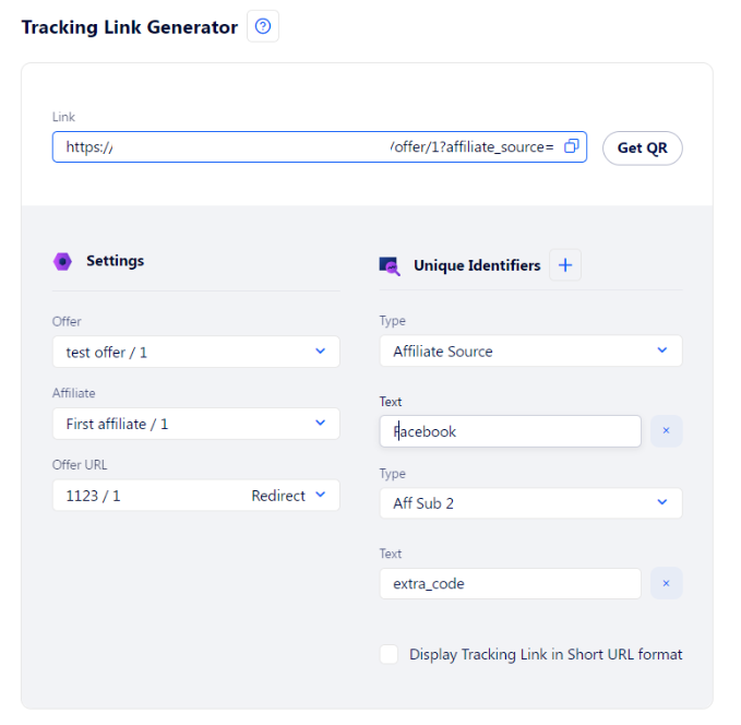
There are two columns of configuration fields in the Tracking Link Generator:
Settings: necessary data for the correct functioning of the Tracking Link. It includes the following fields:
Offer: the Offer that is being promoted via the link. It also narrows the list of available pages that need to be advertised – Offer URLs.
Affiliate: the Affiliate who is to generate traffic using this link. If the link is passed to a different Affiliate, it will track data incorrectly and will assign all clicks to the Affiliate mentioned in the field but not the one who has actually generated the traffic.
Offer URL: the advertised page where the leads will be redirected after clicking the link.
Unique Identifiers: additional tracking data. You can set as many parameters as you like and provide custom information via 20 unique Aff Sub fields. All these data will be recorded in the Clicks table and assigned to a click each time a lead opens that tracking link. Here’s an article on how you can implement targeting to increase ROI.
Currency
The Dashboard shows data devoted only to a single currency at a time. The data that are not relevant for the selected currency is not shown on this page.
If several currencies are allowed in your CRM, you can select the Currency using the special drop-down list in the top right corner.


